CSS Grid
Learn How to Create Dynamic and Responsive Web Layouts with CSS Grid


Introduction
CSS Grid is a powerful layout system that allows you to create complex, responsive layouts with ease. It is a two-dimensional grid-based layout system that enables you to create complex layouts by dividing a page into rows and columns. You can then place elements anywhere within these rows and columns to create a layout that suits your needs. In this article, we will explore the various properties and features of CSS Grid, along with some code examples.
What is Grid
A grid is a set of intersecting horizontal and vertical lines defining columns and rows. Elements can be placed onto the grid within these column and row lines. CSS grid layout has the following features:
Fixed and flexible track sizes
You can create a grid with fixed track sizes – using pixels for example. This sets the grid to the specified pixel which fits to the layout you desire. You can also create a grid using flexible sizes with percentages or with the fr unit designed for this purpose.
Item placement
You can place items into a precise location on the grid using line numbers, names or by targeting an area of the grid. Grid also contains an algorithm to control the placement of items not given an explicit position on the grid.
Creation of additional tracks to hold content
You can define an explicit grid with grid layout. The Grid Layout specification is flexible enough to add additional rows and columns when needed. Features such as adding "as many columns that will fit into a container" are included.
Alignment control
Grid contains alignment features so we can control how the items align once placed into a grid area, and how the entire grid is aligned.
Control of overlapping content
More than one item can be placed into a grid cell or area and they can partially overlap each other. This layering may then be controlled with the z-index property.
Grid Container
The first step in using CSS Grid is to create a grid container. This is done by setting the display property to grid on an element that contains the items you want to position.
<div class="wrapper">
  <div>One</div>
  <div>Two</div>
  <div>Three</div>
  <div>Four</div>
  <div>Five</div>
</div>
.wrapper {
  display: grid;
}
Once you have created a grid container, you can start defining rows and columns for your grid.
Grid Tracks
A grid track is the space between any two adjacent lines on the grid. The image below shows a highlighted track – this is the first-row track in our grid.
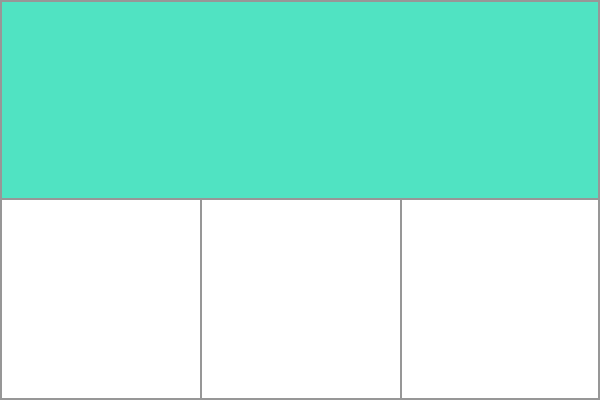
You can create tracks by using the grid-template-rows and grid-template-columns properties, which allow you to specify the size and number of rows and columns in your grid. Here's an example of how to create a grid with two columns and three rows:
.wrapper {
 display: grid;
  grid-template-columns: 1fr 1fr;
  grid-template-rows: 100px 200px 300px;
}
In this example, the wrapper is set to display as a grid, and the grid-template-columns property is set to 1fr 1fr, which creates two columns with equal widths. The grid-template-rows property is set to 100px 200px 300px, which creates three rows with different heights.
You can also use the repeat function to create a large number of tracks with the same size. For example, the following code creates a grid with ten columns, each with a width of 1fr:
.wrapper {
display: grid;
grid-template-columns: repeat(10, 1fr);
}
In addition to specifying the size and number of tracks, you can also use the grid-auto-rows and grid-auto-columns properties to define the size of tracks that are created automatically. For example, if you have more items than tracks, the grid will create additional tracks as needed. You can use the grid-auto-rows property to specify the height of these tracks, and the grid-auto-columns property to specify the width.
.wrapper {
  display: grid;
  grid-template-columns: 1fr 1fr;
  grid-template-rows: 100px 200px;
  grid-auto-rows: 50px;
}
In this example, the grid-container has two columns and two rows, but if you add more items to the grid, it will create additional rows with a height of 50px.
Grid Lines
In CSS Grid, grid lines are used to define the boundaries of the rows and columns within the grid. They are used to position items within the grid and are identified by numeric indices, starting with 1.
You can define grid lines by using the grid-template-rows and grid-template-columns properties. These properties allow you to specify the size and number of rows and columns in your grid, as well as the positions of the grid lines.
Here's an example of how to define grid lines for a grid with two columns and three rows:Here's an example of how to define grid lines for a grid with two columns and three rows:
.wrapper {
  display: grid;
  grid-template-columns: 100px 200px;
  grid-template-rows: 50px 100px 150px;
}
In this example, the grid-container has two columns with widths of 100px and 200px, and three rows with heights of 50px, 100px, and 150px. The grid lines for this grid are as follows:
-The first column starts at grid line 1 and ends at grid line 2. -The second column starts at grid line 2 and ends at grid line 3. -The first row starts at grid line 1 and ends at grid line 2. -The second row starts at grid line 2 and ends at grid line 3. -The third row starts at grid line 3 and ends at grid line 4.
You can also use the grid-column and grid-row properties to position items within the grid using the grid lines. For example, the following code positions an item in the first row and first column of the grid:
.grid-item {
 grid-column: 1 / 2;
 grid-row: 1 / 2;
}
In this example, the grid-column property specifies that the item should start at grid line 1 and end at grid line 2, and the grid-row property specifies that it should start at grid line 1 and end at grid line 2. This positions the item in the first row and first column of the grid.
Grid Cells
A grid cell is the smallest unit on a grid. grid cells are the rectangular areas created by the intersection of rows and columns in a grid layout. These cells are where you can place items, such as text or images, to create a complete layout.
Grid cells are identified by the row and column that they occupy. For example, in a grid with two columns and three rows, the cell in the first row and first column would be identified as (1, 1), the cell in the first row and second column would be identified as (1, 2), and so on.
To position items within grid cells, you can use the grid-column-start, grid-column-end, grid-row-start, and grid-row-end properties. These properties allow you to specify the starting and ending grid lines for the item, effectively defining the cell that the item should occupy.
.grid-item {
  grid-column-start: 1;
  grid-column-end: 2;
  grid-row-start: 2;
  grid-row-end: 3;
}
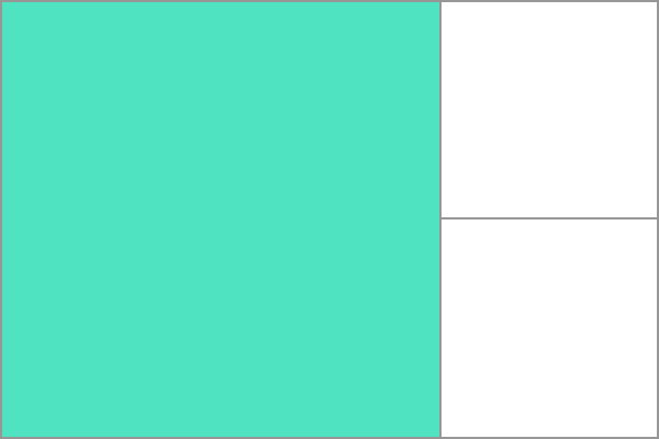
Grid Area
Items can span one or more cells both by row or by column, and this creates a grid area. Grid areas must be rectangular – it isn't possible to create an L-shaped area for example. The highlighted grid area spans two row and two column tracks.
Gutters
Gutters refer to the space between grid items, columns, and rows. By default, there is no space between grid items, which can make it difficult to visually separate items or columns within a grid. Gutters can be added to a grid layout using the grid-gap property.
The grid-gap property sets the size of the gap between grid items, and can be used to create gutters between rows, columns, or both. The property takes two values: the first value sets the size of the gap between rows, and the second value sets the size of the gap between columns. If only one value is specified, it applies to both rows and columns.
Here's an example of how to add gutters between columns in a grid:
.wrapper {
  display: grid;
  grid-template-columns: repeat(3, 1fr);
  grid-gap: 20px;
}
In this example, the grid-container has three columns, each with a width of 1fr. The grid-gap property is set to 20px, which creates a 20px gap between each column.
You can also use the grid-row-gap and grid-column-gap properties to set the size of the gap between rows or columns, respectively. For example:
.wrapper {
  display: grid;
  grid-template-columns: repeat(3, 1fr);
  grid-template-rows: repeat(3, 1fr);
  grid-row-gap: 20px;
  grid-column-gap: 10px;
}
In this example, the grid-container has three columns and three rows, each with a width and height of 1fr. The grid-row-gap property is set to 20px, which creates a 20px gap between each row, and the grid-column-gap property is set to 10px, which creates a 10px gap between each column.
Overall, gutters are an important part of creating a visually appealing grid layout in CSS Grid. By using the grid-gap, grid-row-gap, and grid-column-gap properties, you can create a layout with the right amount of space between items, columns, and rows.
Nesting grids
In CSS Grid, it is possible to nest grids within each other. This can be useful for creating complex layout structures that require multiple levels of organization. To nest grids, you simply create a grid container within another grid container.
Here's an example of how to nest grids in CSS:
.outer-grid {
  display: grid;
  grid-template-columns: 1fr 1fr;
  grid-template-rows: auto;
  grid-gap: 20px;
}

.inner-grid {
  display: grid;
  grid-template-columns: 1fr 1fr;
  grid-template-rows: auto;
  grid-gap: 10px;
}

.item {
  background-color: #ccc;
  padding: 20px;
}
.outer-grid {
  display: grid;
  grid-template-columns: 1fr 1fr;
  grid-template-rows: auto;
  grid-gap: 20px;
}

.inner-grid {
  display: grid;
  grid-template-columns: 1fr 1fr;
  grid-template-rows: auto;
  grid-gap: 10px;
}

.item {
  background-color: #ccc;
  padding: 20px;
}
<div class="outer-grid">
  <div class="item">Item 1</div>
  <div class="item">Item 2</div>
  <div class="item">Item 3</div>
  <div class="item">Item 4</div>
  <div class="inner-grid">
    <div class="item">Nested Item 1</div>
    <div class="item">Nested Item 2</div>
    <div class="item">Nested Item 3</div>
    <div class="item">Nested Item 4</div>
  </div>
</div>
In this example, there are two grid containers: the outer-grid container and the inner-grid container. The outer-grid container has two columns and an auto height, while the inner-grid container has two columns and an auto height as well. Both containers have a grid-gap property defined to create some space between the grid items.
The outer-grid container contains four items, while the inner-grid container contains four nested items. The items and nested items are styled with the .item class, which gives them a background color and padding.
When you run this code, you will see that the outer-grid and inner-grid containers are both displayed with their respective items and nested items laid out in a grid pattern.
Nesting grids can help you create more complex layouts that require multiple levels of organization. By nesting grids within each other, you can create more complex and visually interesting layouts with ease.
Example
This is just an example to give you an idea of how you can use CSS Grid.
<div class="container">
  <div class="box box1">1</div>
  <div class="box box2">2</div>
  <div class="box box3">3</div>
  <div class="box box4">4</div>
  <div class="box box5">5</div>
  <div class="box box6">6</div>
  <div class="box box7">7</div>
  <div class="box box8">8</div>
  <div class="box box9">9</div>
  <div class="box box10">10</div>
</div>
.container {
  display: grid;
  grid-template-columns: repeat(3, 1fr);
  grid-template-rows: repeat(3, 100px);
  gap: 10px;
  justify-items: center;
  align-items: center;
  background-color: #212529;
  padding: 50px;
  border-radius: 10px;
}

.box {
  align-items: center;
  font-size: 5em;
  font-weight: bold;
  color: #f8f9fa;
  border-radius: 5px;
  box-shadow: 0px 0px 10px rgba(0, 0, 0, 0.5);
  transition: all 0.2s ease-in-out;
}

.box:hover {
  transform: scale(1.1);
  box-shadow: 0px 0px 15px rgba(0, 0, 0, 0.7);
}

.box1 {
  grid-column: 1 / 3;
  grid-row: 1 / 2;
  background-color: #ffc107;
}

.box2 {
  grid-column: 2 / 4;
  grid-row: 1 / 3;
  background-color: #dc3545;
}

.box3 {
  grid-column: 1 / 3;
  grid-row: 2 / 4;
  background-color: #007bff;
}

.box4 {
  grid-column: 3 / 4;
  grid-row: 3 / 4;
  background-color: #6f42c1;
}

.box5 {
  grid-column: 2 / 3;
  grid-row: 2 / 3;
  background-color: #28a745;
}

.box6 {
  grid-column: 3 / 4;
  grid-row: 2 / 3;
  background-color: #e83e8c;
}

.box7 {
  grid-column: 1 / 2;
  grid-row: 3 / 4;
  background-color: #ff6b6b;
}

.box8 {
  grid-column: 1 / 2;
  grid-row: 2 / 3;
  background-color: #ffc107;
}

.box9 {
  grid-column: 2 / 3;
  grid-row: 3 / 4;
  background-color: #6c757d;
}

.box10 {
  grid-column: 2 / 4;
  grid-row: 2 / 5;
  background-color: #6c757d;
}
OUTPUT
References
There are numbers of resources to learn Css Grid , I would like to share 2 resources that I refer the most for learning CSS.
- MDN Docs https://developer.mozilla.org/en-US/docs/Web/CSS/grid
CSS Tricks https://css-tricks.com/almanac/properties/g/grid/
Do try this game , Grid Garden https://cssgridgarden.com/
I hope this article has been helpful in getting you started with CSS Grid.