Understanding Media Query
Simplifying the Media queries to build responsive web.
Table of contents
What is media query
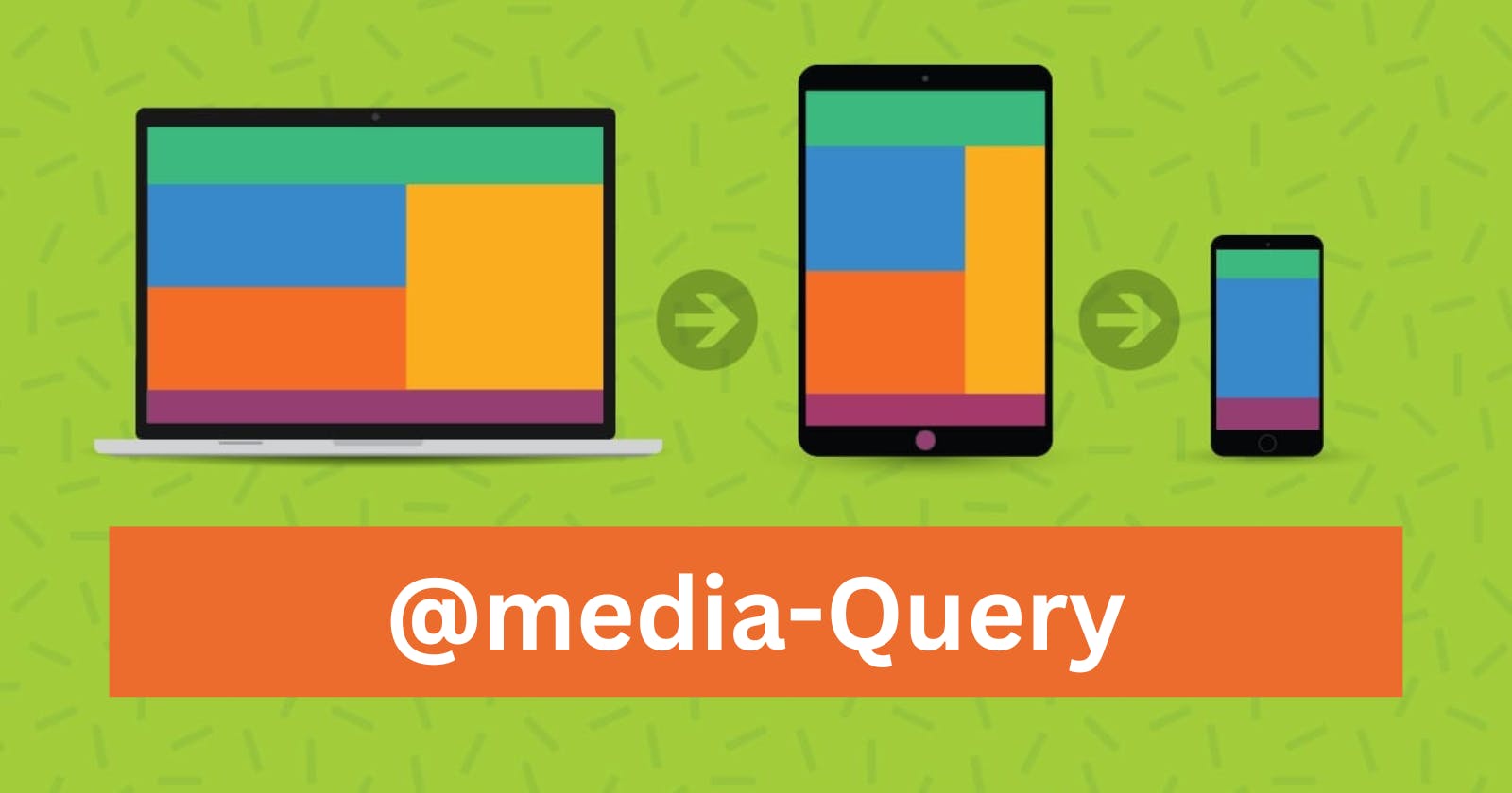
CSS media queries are a powerful tool for responsive web design. They allow you to apply different styles to a website based on the characteristics of the device or browser being used to view it. This allows you to create a website that looks great on all devices, from desktop computers to mobile phones.
A media query consists of a media type and one or more expressions that test for certain conditions. The media type specifies the type of device being used to view the website, such as a screen or a printer. The expressions test for various conditions, such as the width of the viewport or the device's orientation.
Here is an example of a media query:
@media only screen and (max-width: 600px) {
  /* Styles to apply to devices with a viewport width of 600px or less */
}
Breakpoints
A breakpoint in a media query refers to a specific point or range of points where the styles defined within the media query will be applied. Breakpoints are commonly used in responsive web design to ensure that a website's layout and design adjust appropriately to different screen sizes and devices.
Media queries allow you to specify different CSS styles for different devices or device characteristics. You can define media queries with specific conditions, such as the screen width or height, the device orientation, or the resolution.
When the device meets the conditions specified in the media query, the CSS styles within that media query will be applied. This allows you to create a responsive design that adapts to different devices and screen sizes.
Breakpoints are used to define the points at which the styles defined in a media query will be applied. For example, you might define a media query that applies to screens with a maximum width of 768 pixels. The breakpoint in this case is 768 pixels, and any device with a screen width below that point will receive the styles defined within the media query.

Common breakpoints for responsive web design include:
- 320px: This is the width of many smartphones in portrait mode.
- 480px: This is the width of some larger smartphones in portrait mode.
- 768px: This is the width of most tablets in portrait mode.
- 1024px: This is the width of many tablets in landscape mode and smaller laptop screens.
- 1200px: This is the width of larger laptop screens.
/* Extra small devices (phones, 600px and down) */
@media only screen and (max-width: 600px) {...}

/* Small devices (portrait tablets and large phones, 600px and up) */
@media only screen and (min-width: 600px) {...}

/* Medium devices (landscape tablets, 768px and up) */
@media only screen and (min-width: 768px) {...}

/* Large devices (laptops/desktops, 992px and up) */
@media only screen and (min-width: 992px) {...}

/* Extra large devices (large laptops and desktops, 1200px and up) */
@media only screen and (min-width: 1200px) {...}
Orientation
Media queries can also be used to change layout of a page depending on the orientation of the browser.
You can have a set of CSS properties that will only apply when the browser window is wider than its height, a so called "Landscape" orientation
@media only screen and (orientation: landscape) {
  body {
    background-color: lightblue;
  }
}
Reference
Refer this Link for complete guide on CSS Media Query.
